Task

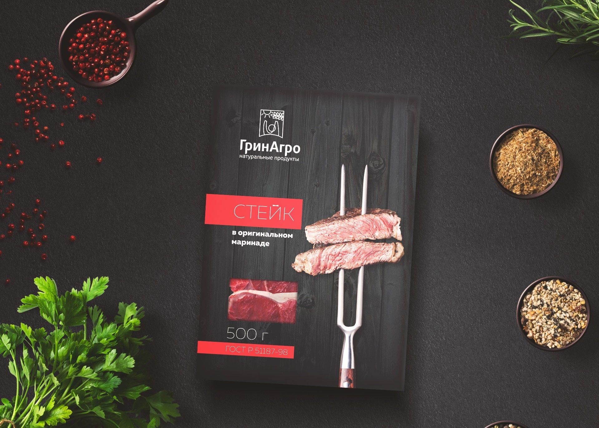
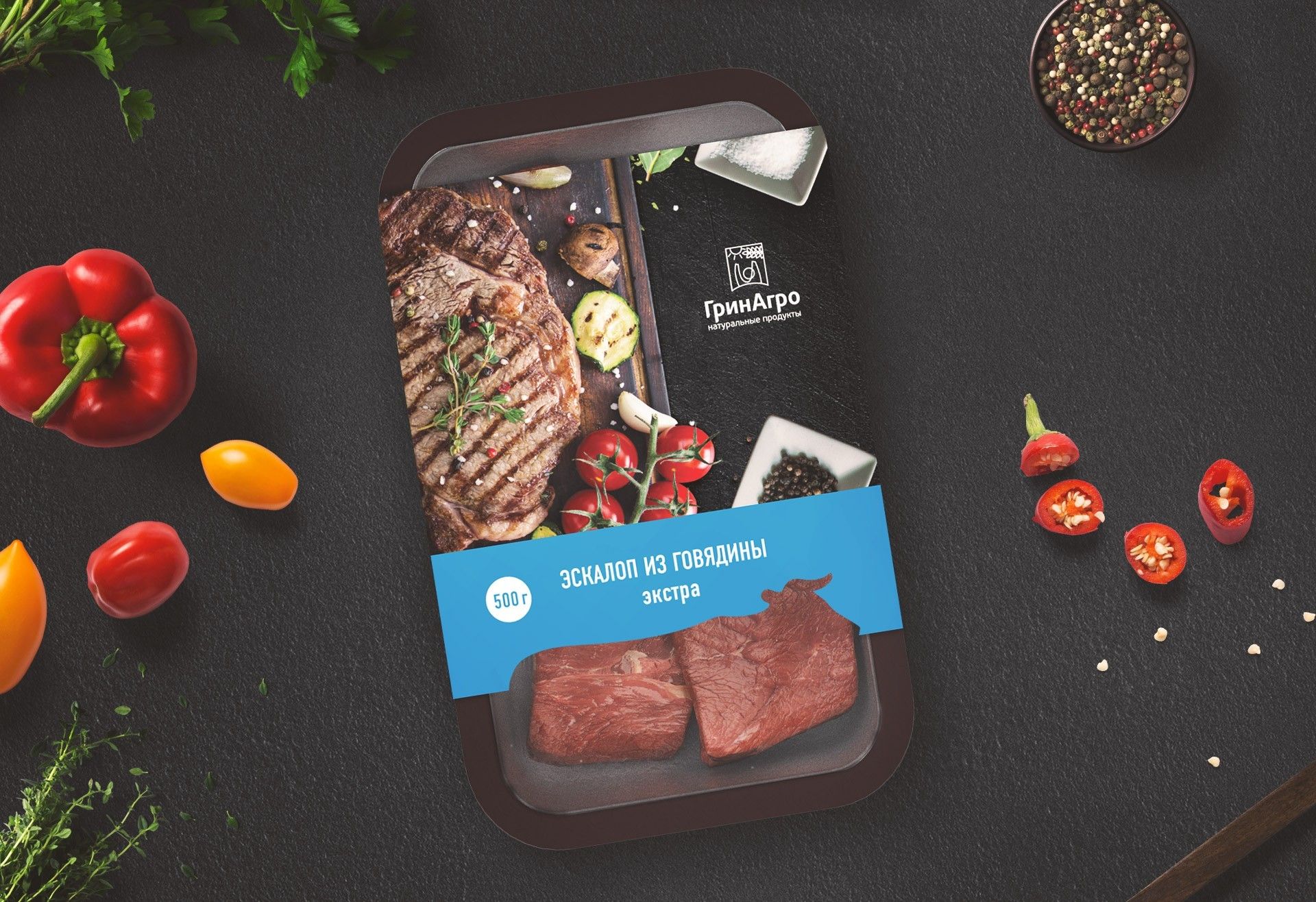
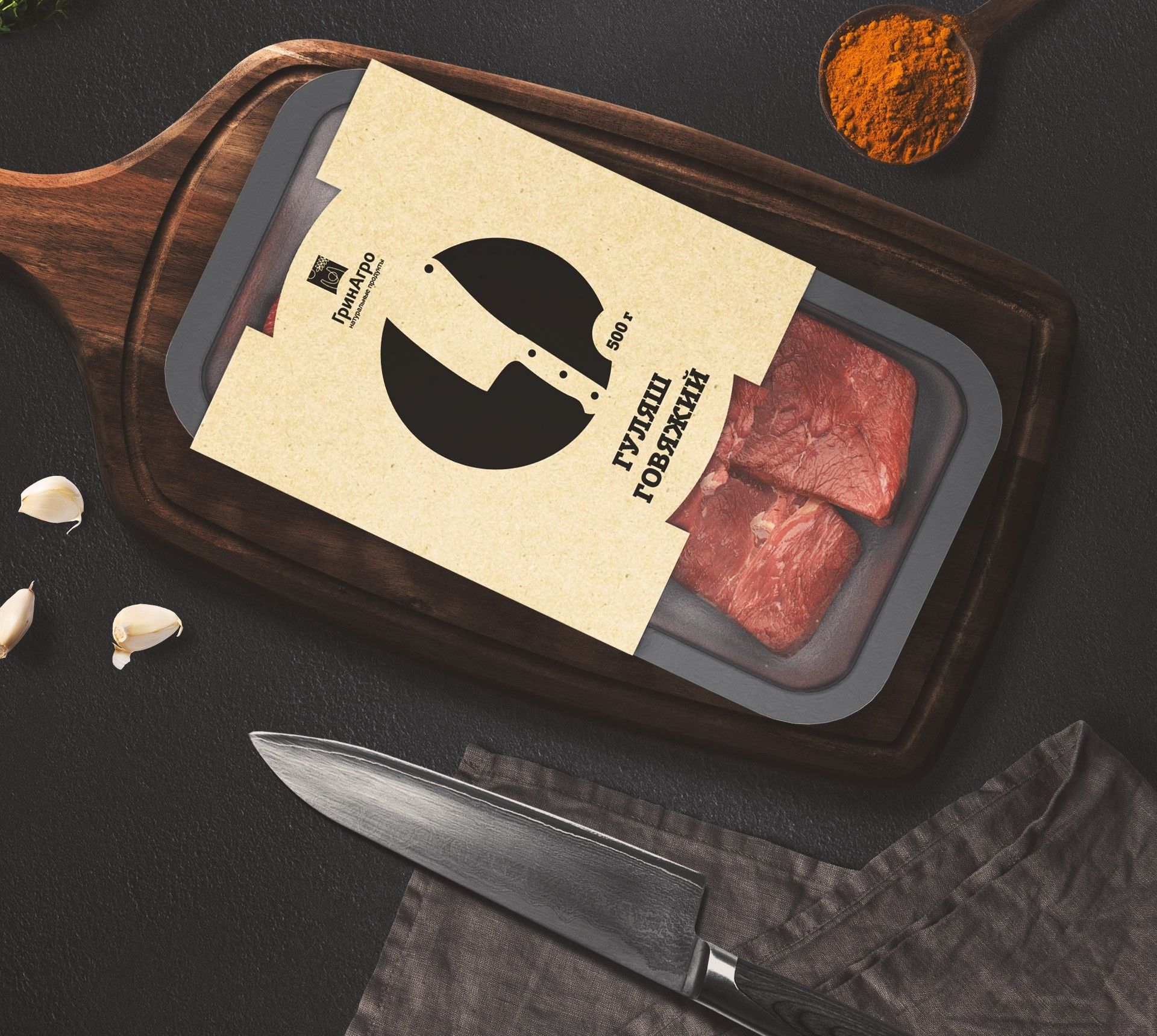
We were faced with the task of developing the concept of packaging meat products under the “GreenAgro” brand. A saturated competitive market and conservatism of consumer behavior imposed special restrictions on packaging design. The course of the analysis was based on data from the research of opinions and opinions of consumers, as well as their psychographic characteristics of behavior. The analysis showed that the key needs of the target audience are in the area of ​​the taste of the product and the naturalness of its components. It is this key moment that the agency team implemented through packaging design, creating it in three graphical versions.

Main solution

Three variants of packaging design, made on the basis of materials available on the Russian market. All models have a deep adaptability depending on the task and market changes. Also, the packaging design can be modified inside its layout when approaching a separate SKU. One of the main tasks for the agency was the development of a system of visual identification of an individual name or its group among the entire line of meat packaging. For consumer identification of the product, various differentiation tools are used (color, pictograms, photographic image).

First option

The development of this package was based on the standard size of the plastic substrate, but it is also perfectly suited for the use of vacuum packaging. Through the design, the premium of the product and its quality are broadcast. Having a non-standard form factor for meat products (a box with a locking mechanism), the product not only stands out on the store shelf, but also perfectly retains its visual quality (integrity) after opening it. The packing head shows the finished product, and through the technological opening, the consumer has the opportunity to see the purchased product (“before-after” effect). For the convenience of differentiating product names, a color scheme and a photograph of the finished product are used.

Дизайн упаковки мяса
Second option

The advantage of this packaging design is that the visual elements used in the design underlie the key brand products. The visual recognition of the corporate identity and color schemes of the brand help to quickly identify it on the shelf as one of the products of the GreenAgro. For the convenience of differentiating product names, a color scheme is used that encircles the package.

Дизайн упаковки мясной продукции в стиле ГринАгро
Third option

Such a solution as the use of craft (decorative) paper, although common in the west, is extremely rare in the Far East. In this case, this approach of visual solution helps to select the product on the shelf among third-party products. The use of natural elements in the design of packaging, such as jute, textured cardboard and, possibly, wax seal gives the buyer a tactile and visual sense of the naturalness of the product.

Дизайн упаковки мяса. Крафт