Task
To develop a logo and corporate identity for Aqua Solutions. Make up guidelines and prepare layout templates.
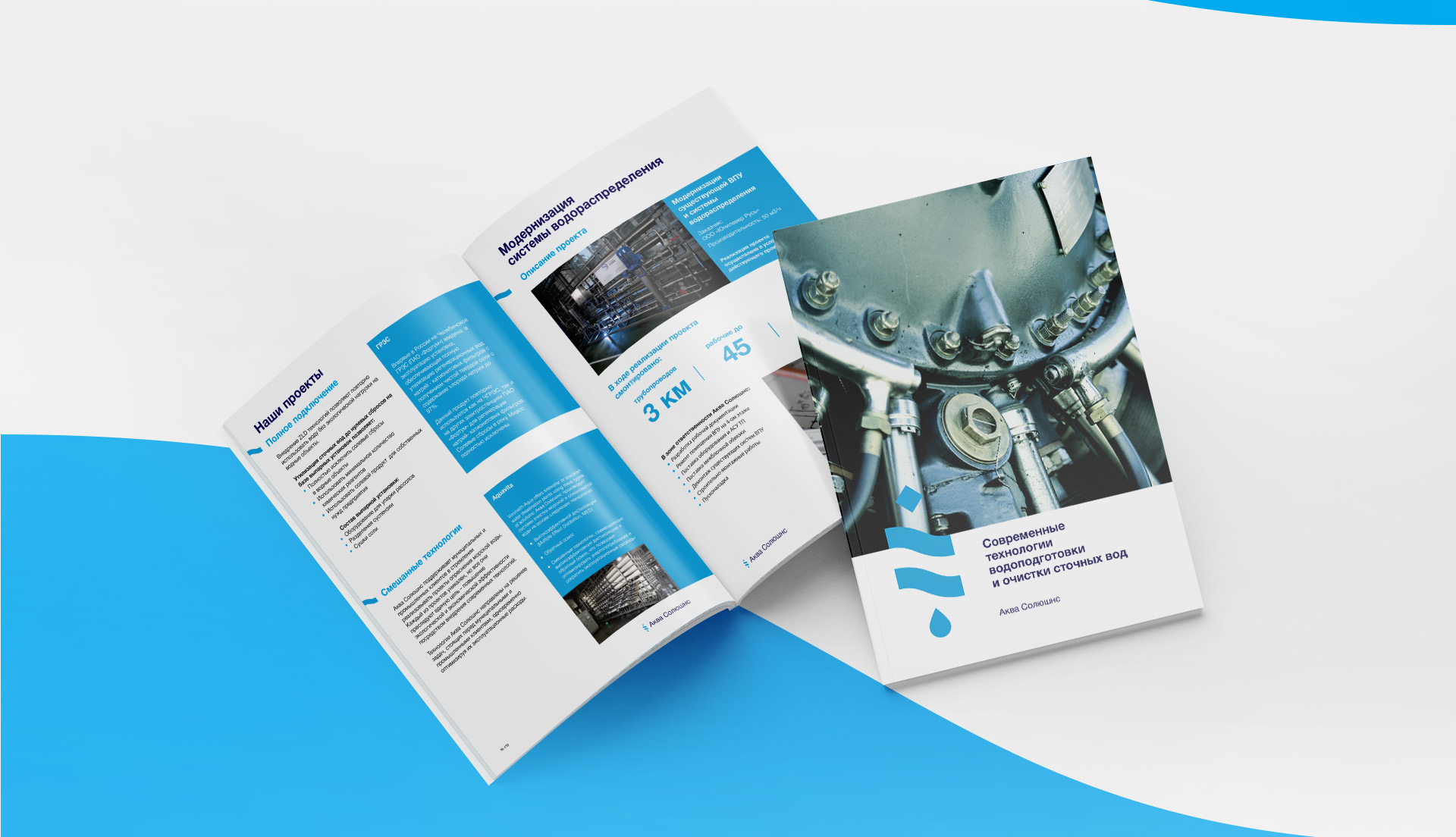
The company was founded in 1995 and occupies one of the leading places in Russia in the field of complex solution of issues of water treatment and wastewater treatment of industrial and municipal enterprises. They design, reconstruct and build new water infrastructure in industrial and civil facilities.
Designed by order of the Brand hub.
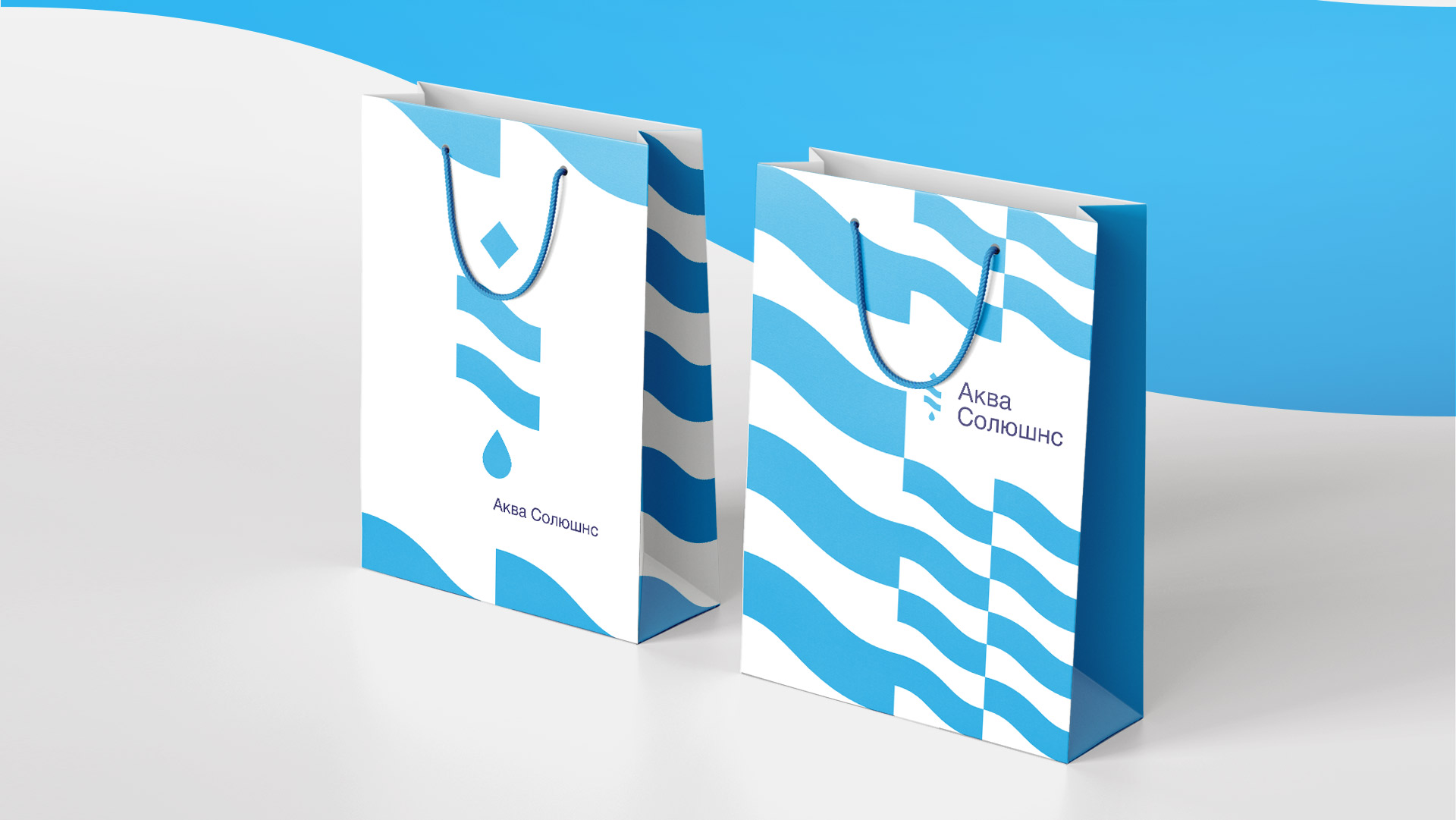
The logo is a visual metaphor for the company’s core business – water treatment and water purification. The rhombus, as a symbol of something foreign, is transformed into a drop of pure water, passing through the “filter” in the form of waves. The blue colors of the logo evoke associations with water, purity and naturalness, demonstrating the field of activity and shaping the company’s image for the consumer.