Task
Create a logo and corporate identity for TomaDoma’s chain of stores, design a visual navigation system and interior design of corporate elements. Develop a corporate identity guideline.
Create a logo and corporate identity for TomaDoma’s chain of stores, design a visual navigation system and interior design of corporate elements. Develop a corporate identity guideline.
TomaDoma is a new network of stores for household goods and interior decoration in Vladivostok.
The severity of the lines and the clear lines of the materials became the characters of the modern interior. Many designers who create objects that fill the space of our house adhere to the principles of minimalism and simplicity. It is this trend that formed the basis for visual brand identification. A clean and strict image, devoid of distracting elements, is easily remembered and simple in perception.

The logotype of the store “TomaDoma” combines the sign and font part. The sign is a black frame symbolizing the outline of the room, and a green square with a contour image of the lamp.
Main logo
Line version
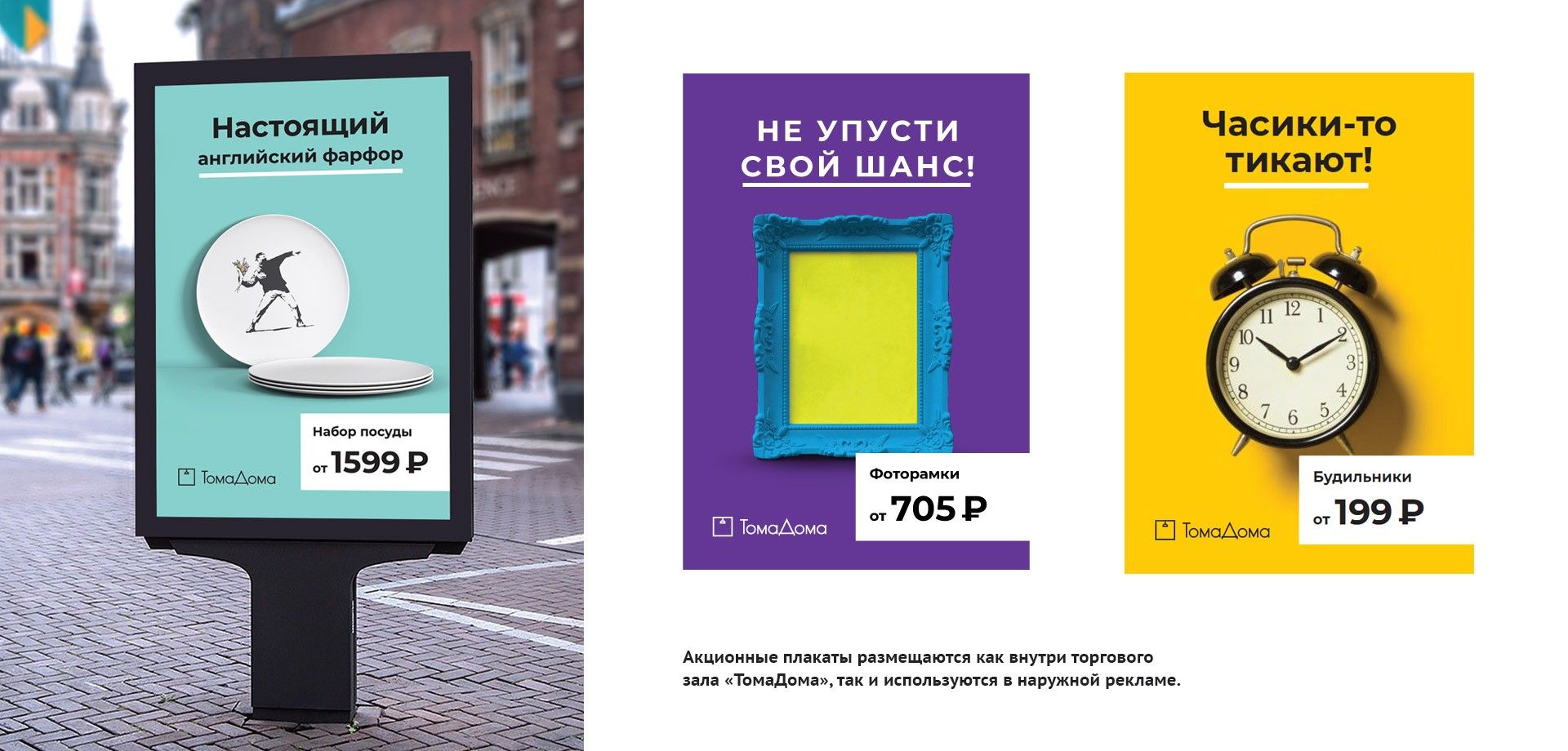
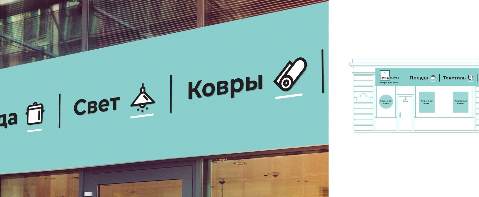
When working with a corporate identity, a package of 56 icons was developed for working with the navigation in the halls of the store and advertising products. A grid has also been created and rules have been drawn up for construction, which helps to maintain the general style and makes it possible to create a new icon for a specific task.