Task and client
Paranog is a small retailer specializing in colorful socks. The target audience is teenagers aged 12-18, so the company refused to create a traditional monobrand store, and made Instagram, a website and stands in partner stores the main sales channels.
Our task was to develop a bright and versatile image that will allow you to combine socks of various types and manufacturers under one brand.
Solution
Naming — Paranog, a short and concise name that plays around the theme of socks and legs. The name is easy to remember and convenient to use.
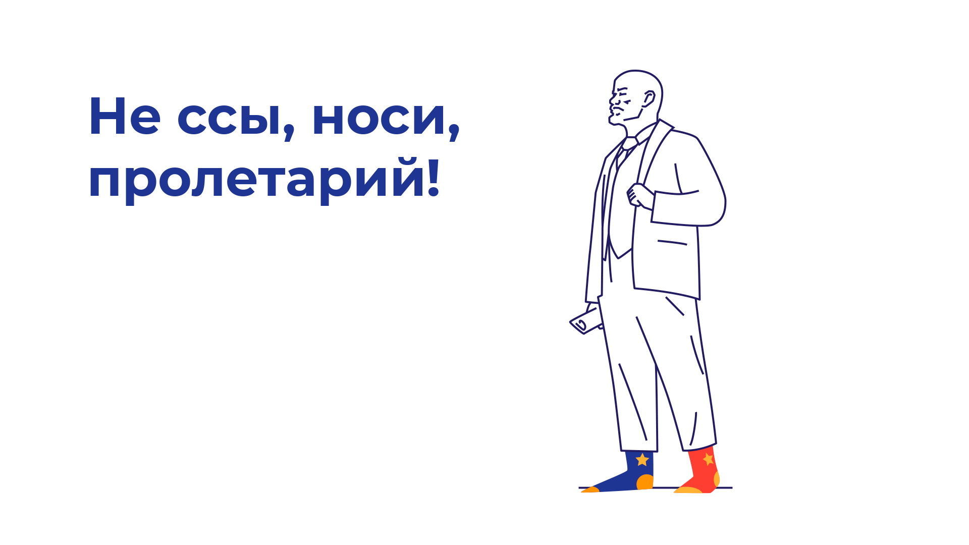
Illustrations. In support of the rebellious image and the defiant slogan of men’s socks, the concept of a series of illustrations was developed, mainly based on a well-known serious male politician who had a strong influence on world history in bright socks.
Mascots
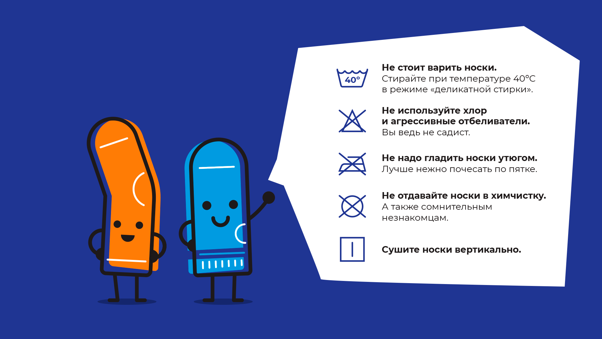
The main characters are two small bright socks. The main task is to illustrate and convey important information to the consumer in a fun way.
Packaging
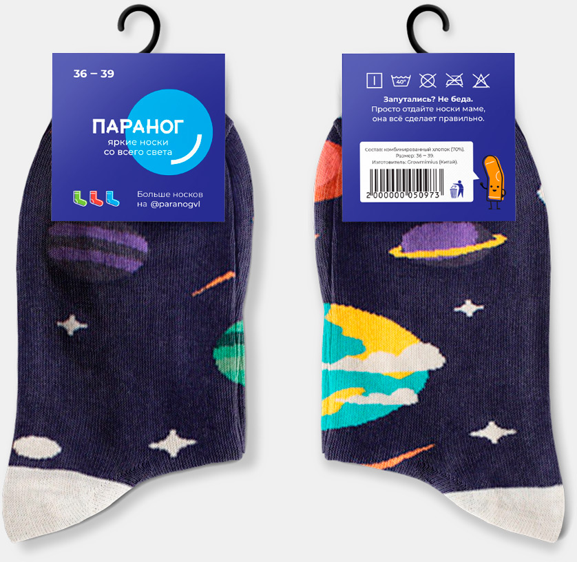
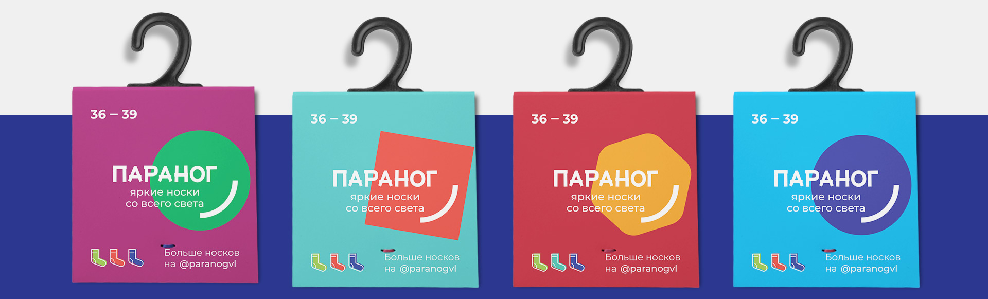
Due to the large gap in the interests of the target audience (girls 12 years old and boys 16 years old), we divided the packaging into two groups: women’s and men’s socks. The label of women’s socks is made in bright colors, which allows you to visually organize a huge number of types of socks.
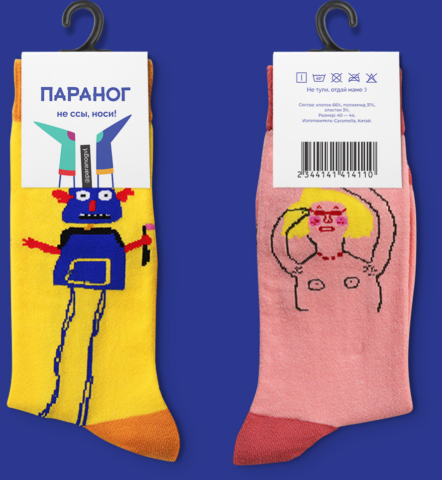
The label for men’s socks is white, with an illustration of a pair of legs in bright socks and the slogan “Don’t flip your shit – wear it!”

Design
In the design of social networks and advertising materials, simple linear graphics and vibrant backgrounds are used to group the assortment of socks by type or series.
