Task and client
“STDK” is engaged in integrated design and construction diagnostics of new facilities, reconstruction of buildings and structures. The company’s experience, technical equipment and high qualification of the team allow them to successfully carry out the most complex tasks in public and industrial facilities. The company is originally from Vladivostok, but it carries out many projects throughout the Far East and Siberia.
Our task was not only to create a new company logo, but also to bring all visual elements to a general form and set the direction for the development of corporate identity.
Branding
The new logo is a fresh approach to communication, and corporate identity elements will standardize corporate media. With this, the company seeks to attract more projects from the commercial sector, and broadcast high-level expertise and team experience. STDK is developing rapidly, and inevitably changing. During the rebranding, we wanted to capture the changes that had occurred to the company during its existence, on the one hand, and on the other, it was important for us to show continuity in the work on the new corporate identity, to take into account color solutions and the primary form. The positioning of the company from the “design and research company” into “architecture, research, expertise” was redefined, highlighting the company’s strengths.
Logotype
The client wanted to keep the continuity from the old logo in the form of an orange color and arrows (more like double quotes, “Christmas trees”), which were supposed to be read as the last letter “K”, but alas. We identified two main problems with the current logo: the letter “K” was completely unreadable, and it was also impossible to understand in what language the name of the company was written. The solution was to break the logo into a sign and font part, which will allow it to be combined and used separately from each other on different media. And use the classic letter “D” in the font part.
The client is engaged in architectural design and construction expertise, perceiving these disciplines as parts of one whole, which means that the logo should turn out to be “unifying”. We wanted to emphasize our characteristic features, to place new accents on architectural, research and expert work, to make the logo more understandable, modern and readable. When working on the image of the sign, we took the engineering scheme of the building as a basis, and the graphic solution was to combine two trapeziums that create a volumetric arrow. So the sign turned out to be understandable, with strict geometry, which sets the expert tone.
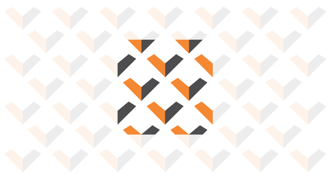
Pattern
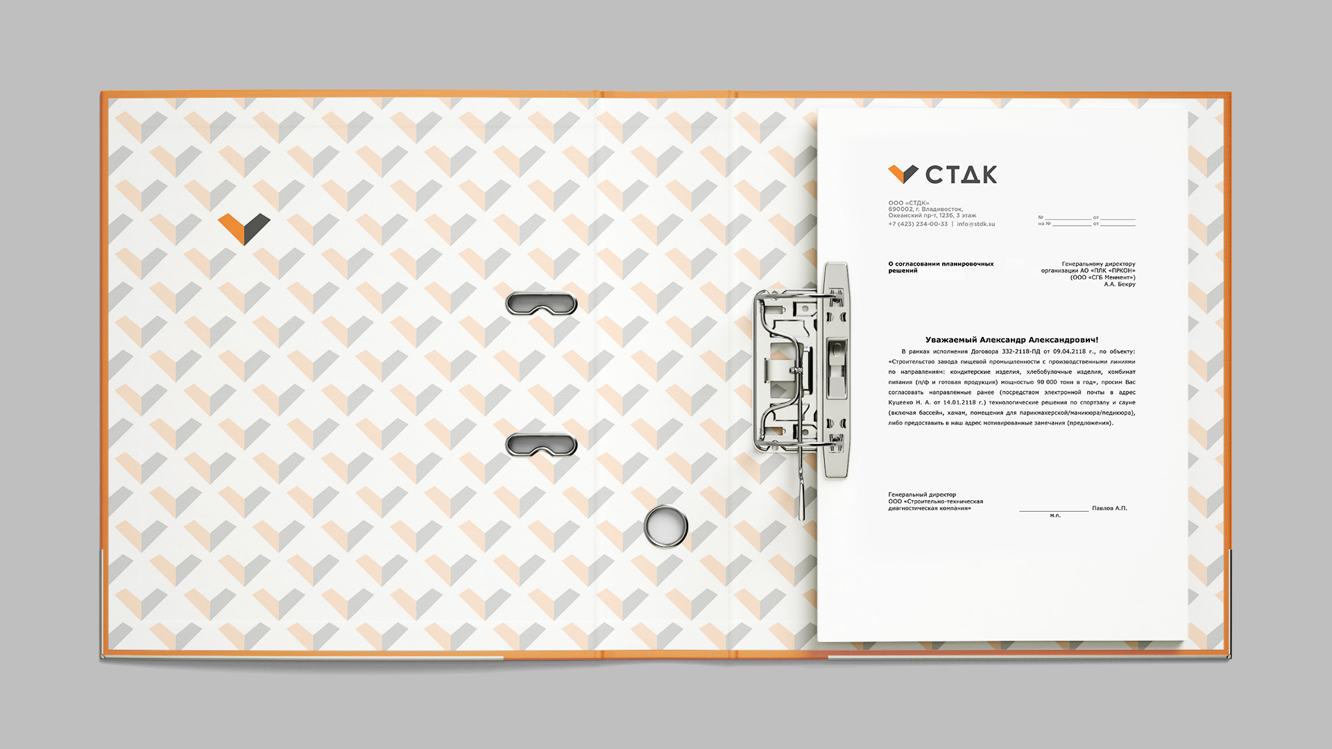
A seamless pattern based on the company’s sign creates an interesting illusion of the three-dimensional character (in the form of a truncated pyramid). It can be used as a background of a whole carrier, as well as hotel design elements. If the pattern is too bright for the carrier, its opacity drops to 25%. At the same time, as an accent, one or several signs remain completely opaque.
Corporate identity
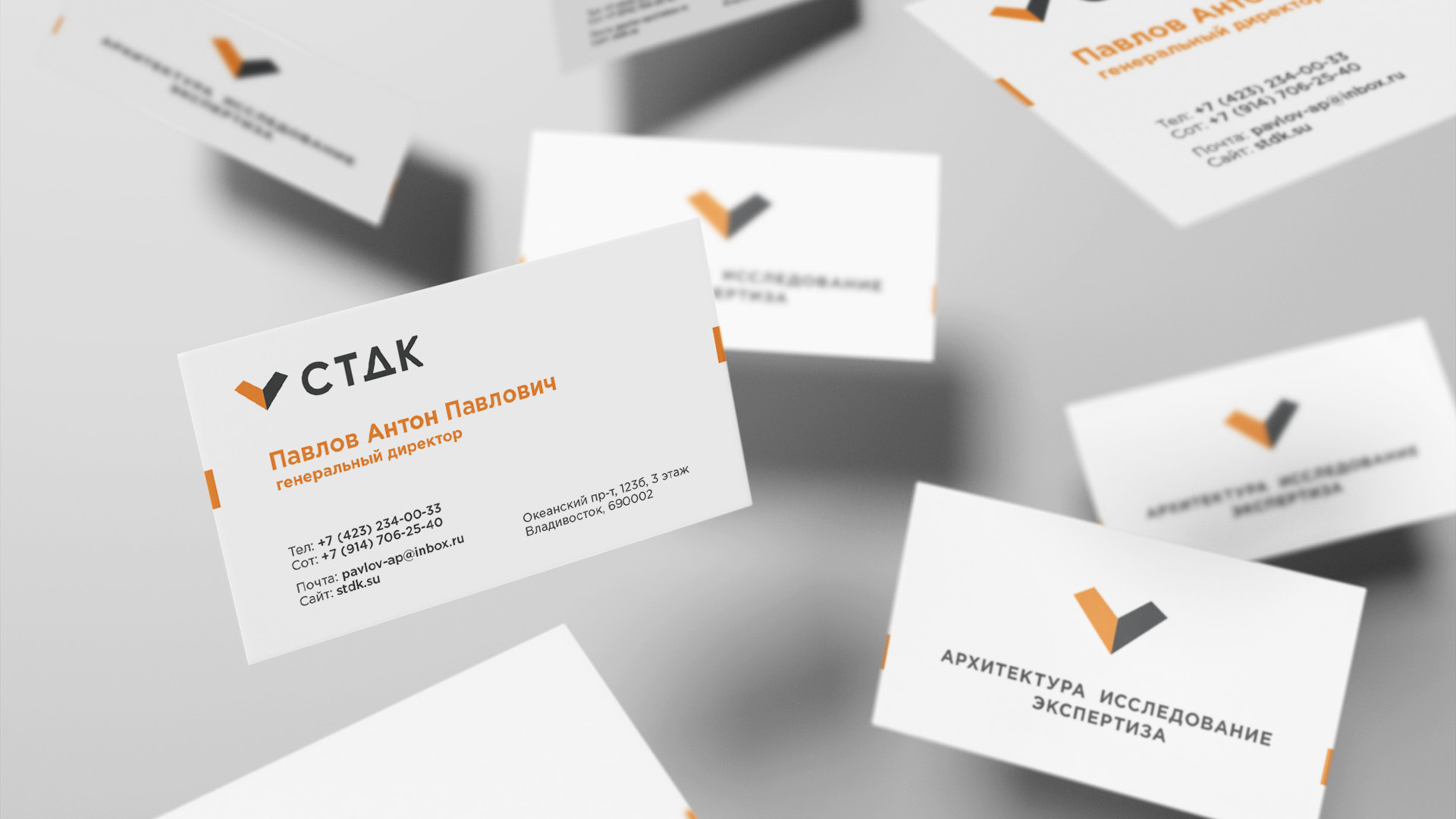
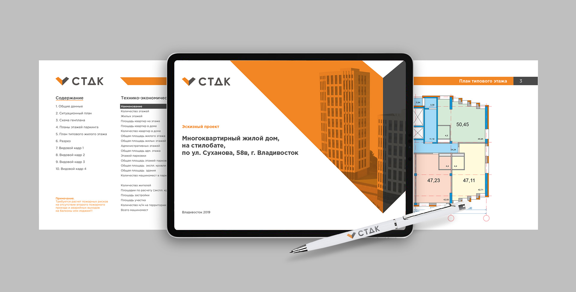
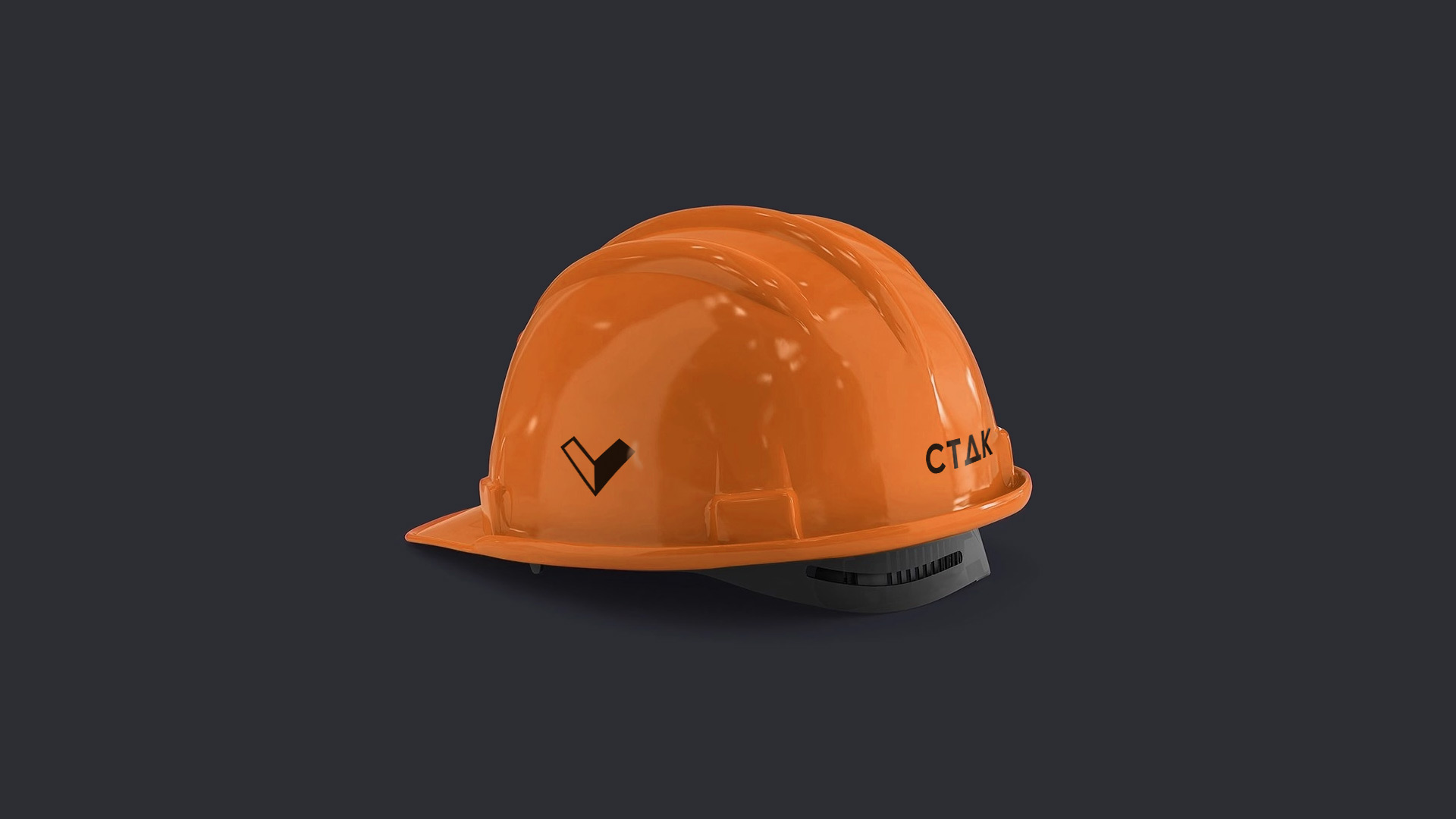
Corporate identity contains everything you need for a full and confident exit of the company in the B2B segment. Created universal templates for corporate and technical presentations, allowing to provide the customer with any project. Business cards, forms and other elements of corporate documentation emphasize and form a complete image of a confident and experienced company. Also, we have not forgotten about souvenirs, as a mandatory element of corporate communication. When working on elements of corporate identity, we adhered to the main rule – everything should be easy and clear, without too much graphic noise – like a good engineering scheme.